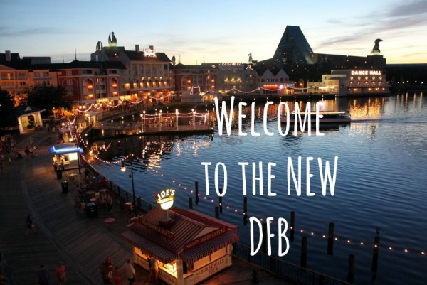
WELCOME to the new and improved Disney Food Blog website!
Surprised you this morning, didn’t we? 🙂
We are SO excited to present our brand new home base to you today, with the goal of providing you — our readers — with a much more user-friendly experience to make your Disney vacation planning (and dining!) even more seamless!
And so with that, let’s do a little walk-through so you can know where to go to find the information you need the most!
“So what are the improvements?”
I’m glad you asked! 😉 We’ve been working on ways to make it much easier to find the information you need. For instance…
We’ve got a brand new menu at the top of our home page so you can find exactly the information you’re looking for at a glance. From your favorite Disney recipes to easy access to reviews for the restaurants you might be considering for your next Disney vacation.
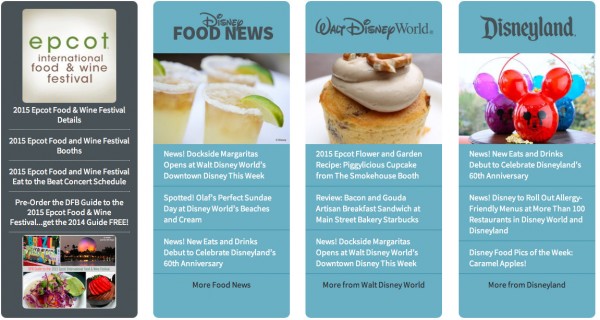
Looking for the latest and greatest food news? Just visit the Disney Food News section highlighted on the Home page.
Are you planning a trip to Disneyland? Then you’ll want to check out our specific section for Disneyland (and vice-versa for Disney World trip planners!), also found on the home page!
“But, AJ, I liked the site just the way it was…”
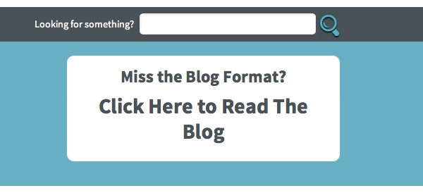
No problem! We are still the Disney Food BLOG, so if you prefer to read the blog the same way you always have, you can just
click our “Read the Blog” icon in the top right corner.
It’s A Work in Progress…
Of course, this much change all at once means we’ll need your help to ensure your experience is excellent.
We’ll be continuing to update the site, improve the menu section at the top with even more detailed information, and beautify some of the site components over the next several weeks and months. But if there’s a part of your experience here you’d like to see improved, we’d love to hear from you. Please click here to send us an email with your thoughts.
No matter what kind of info you’re looking for, we hope you have fun checking out our new look while enjoying the same thing we’ve always offered: the best in Disney food news and reviews!
Make yourself at home… and we’ll see you back here real soon!






 Our handy (and portable!) ebook guides make sure you get the best deals and can plan a vacation of a lifetime.
Love it! 😀
One thing though, if I go to the Home page, the big grey bar at the top is HUGE and overprints your main banner. To try and explain it better, if you go to the Disney Dining Planning tab at the top and open it, you get a deep panel with a white background and all the links in, right? Imagine that panel is the solid grey and permanently open and that’s what I see when I go to the Home page.
For reference I’m on a mac and use Safari. Hope that helps.
Aside from that though, looking good! Will take a bit of getting used to, but I like it 🙂
Love the new look but uour top navigation bar takes up 1/3 of the screen.
I am having the same issue. When I hit the read the blog section, the gray bar covers half the screen on my iPad. I checked both Safari and Chrome and it’s there covering the text
I’m having the same problem with the gray bar. I’m on a Windows desktop, using IE.
When I clicked on the “read more” button, and the page refreshed, the bar went away. But it stays as long as I’m on the main page.
Yep i’m having the same issue with the big grey bar. 🙁
It’s fine once I click read more, but back onto the home page it takes up about 1/3 of the screen.
I agree…very nice, but grey bar takes up lots of room. Also, are you able to add back the “previous post” at the bottom of each article? I like being able to access the previous post when I’ve reached the end to make sure I’m caught up on the news!
Thanks!
I’m seeing a big grey bar across the top half of the screen and not much else.
Same big gray bar problem.
Same problem here, on both Chrome and internet Explorer here. The grey toolbar takes up approximately 50% of the screen. Otherwise, I think the new format looks great,, and easily searchable!
At first I thought I was on the wrong page. 🙂 I started looking around your page and I really like it. Change is good even if sometimes we don’t want it a first.
Keep up the great work AJ.
🙂
Love the new site!
I am seeing the same large green bar. I am using Google Chrome and would be happy to send a screenshot if needed. Love the changes though! 🙂
You already fixed it! Thank you!
Hey Guys, we’re working on the Gray Bar issue so keep letting us know if you’re still seeing it. We also added some previous and next links to the bottom of the posts, which will be improving in the coming days. Keep sending your feedback to help us improve everything we can.
Still seeing the gray bar at the top. I emailed a screen shot a few minutes ago. Otherwise, I like the new design!!
Thanks,
Sara
Change they say is good, sure we will all soon be more familiar with new format…
But my only question….why so much junk at the top…..too much scrolling down to finally get the squeeze….
I guess I missed the gray bar issue? This looks great! My favorite improvement is the share bar on the lefthand side of the page – it’s finally out of the way and I can read the whole post! 🙂 (It used to stick out a little too far and hover over the blog text.)
The graphics look great. but if you could figure out a way to let us taste the the goodies you report on it would be even better!!!
Same grey bar issue on Chrome. Other than that i love the new look!! 🙂
It seems that there are two “subscribe to the DFB newsletter” boxes, one in the horizontal banner with teal background and the other at the top of the right column. Probably best to pare down to just one. 🙂
I find the white horizontal banner with the logo and single ad to be a bit sparse, yet it takes up a lot of screen real estate.
Love the colors and new logo! 🙂
I’m on an Android tablet and I’m sorry to say the site looks terrible. It’s very difficult to scroll way down to see things and it looks very disorganized and a little haphazard. I’m guessing it’s a tablet issue…but the old design was fine on the tablet.
Yup, still seeing that gray bar. It’s also a little difficult to find the latests posts, but I think once you fix the bar the little bit of clutter will be easier to get a handle on.
Oh, I almost forgot – your “Read the Latest Posts” link is tiny. Like tiny tiny. I’m on a Macbook running the latest Chrome browser.
Looks great but it will take a little time getting use to it. I like the way you left the old blog format for the people that will transition slowly..
I didn’t leave a comment about the gray bar because…. 1.) I can scroll past it. 2.) Plenty of other people have mentioned it.
I don’t expect you to do this but what I would like to see is comment likes and replies.
You forgot to include a smell-i-vision tab under each plate of food to click. Also, the general scent of Magic Kingdom’s Main Street: e.g. bakery; Popcorn Wagon; Main Street Confectionary; freshly washed sunny streets and a warm Florida breeze should eminate from the pages at all times. Get on that please!
Other than that, LOVE IT. Thank you AJ and team for your hard work to share all this with us!
I’m having a minor issue with the site. When reading the blog and clicking into the full article it would be nice if when you go back to read the next article it was left where you were before. For example I just read the full article on the new pomegranate margarita and when I go back to read the next article it takes me back to the top of the article on the beer crawl (can’t wait to do that btw). The old version didn’t do this.
I hope this makes sense! Love your website AJ! Thanks for keeping us connected to the World!!
I like the website in general, you make me wanna go to Disney World now and gorge myself on food.
Melodye — Could you send me an email at [email protected] with more info? I’m not sure I’m understanding the problem, and I want to be able to fix it! 😀 Thanks!
I like the new format. I live in California about 7 miles from Disneyland and go there about 8 times a month. I had a 2 week trip to WDW over Christmas and I don’t plan on going there anytime in the near future. I’m finding that the Disney Food Blog is 90% WDW and I really don’t need or want to read about it. Although I did find DFB very helpful and informative when I was planning my WDW vacation, now that I don’t need to know all things WDW, the lack of content about Disneyland has become irritating. I need an option to just click on Disneyland or California Adventure and not have to scroooooollllllllllllll alllllllllllllllllll the way down the page to find out – nope, nothing about Disneyland. Your re-design has done just that. Thank you!!!!!
Love the new format. Easy on the eyes, easy to navigate, I approve! Now if you could just add smell-o-vision…
Love the new look and OLAF!!
Hi AJ,
Love the new site! Great job. I sent you a picture of what I see on my iPad when I open this page.
I love the new look but the grey bar is too big in my opinion. Othere than that is is a great new look and love the teal/grey blue colour.
Well, I decided to change my link so I start with the blog mode….
For my general purpose reading it fits my needs better.