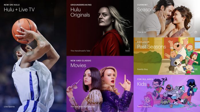
We often find ourselves watching Hulu thanks to the selection of shows and movies, but we do think the platform could be easier to navigate.
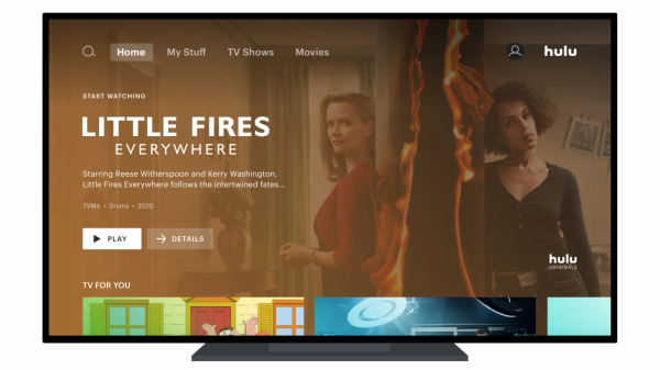
Hulu’s navigation interface is on the challenging side. Unlike most other streaming services, it makes you scroll vertically through every category instead of horizontally. Well, good news! It looks like Hulu is getting an update — and it’s going to look a lot like Disney+.
According to Variety, Hulu is launching a new interface due to the fact that customers have had issues with the old one.
In the new interface, users can navigate through categories vertically and content horizontally instead of vice versa. That sounds familiar because that’s how pretty much every other major streaming service does things — including Disney+. We should also see a change in the way Hulu recommends content.
Major categories like Movies, TV Shows, and Sports will be moving to the main page for easier navigation, too. The update is meant to improve the Hulu experience and provide a more unified look for Disney’s streaming services (Hulu, Disney+, and ESPN+).
The new interface began rolling out to some Roku and Apple TV devices on May 20th and will continue to arrive on devices for the next two months on all platforms. We’re eager to see the new look!
Click here to see what analysts are saying about Disney streaming!
Join the DFB Newsletter to get all the breaking news right in your inbox! Click here to Subscribe!
WE KNOW DISNEY.
YOU CAN, TOO.

Oh boy, planning a Disney trip can be quite the adventure, and we totally get it! But fear not, dear friends, we compiled EVERYTHING you need (and the things to avoid!) to plan the ULTIMATE Disney vacation.
Whether you're a rookie or a seasoned pro, our insider tips and tricks will have you exploring the parks like never before. So come along with us, and get planning your most magical vacation ever!
Are you excited about the new Hulu interface? Tell us in the comments!


 Our handy (and portable!) ebook guides make sure you get the best deals and can plan a vacation of a lifetime.

TRENDING NOW
So many changes are coming to Disney World in 2025, and your chance to ride...
Do you really need to purchase a MagicBand to vacation at Disney World? Let's go...
Here's all the BIG news you missed from Disney World this week!
We just found the BEST inexpensive bag for the parks. Read our full review here!
A brand-new Stanley collection has just landed at Target!
We've gotta talk about the one thing that astonished us about Disney World's newest hotel!
Visiting EPCOT in 2025? Here's why you'll want to prepare for larger crowds throughout the...
It might be winter in Florida, but we're celebrating the reopening of a pool at...
A luxurious way to tour the United Kingdom will be available for travelers in 2025.
We might lose HOURS to this maps feature.
The date is unknown -- but an unsuspecting archivist just found a previously lost photo...
Flights are getting delayed today!
Since you said you were looking for some last minute deals on Disney merch, we've...
Disney World's newest hotel just opened, but is it all that it seems?
Now is a great time to grab those last-minute gifts from Amazon since some really...
Get that last-minute holiday shopping done now!
If you plan on visiting this Disney World hotel over the holiday season, Disney has...
Lightning Lane Premier Pass has sold out for multiple days.
Here are some Disney holiday recipes so you can start planning NOW for those Holiday...
We found bugs on the new Disney Cruise ship, but turns out it was a...