Disney+ is in for another massive revamp!
©Disney
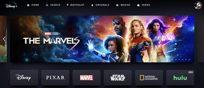
Disney+ has seen some massive success with recently added titles and new technology-driven ways to stream digital content like never before with the use of headsets and environments. However, Disney+ has made another change and this one was hard NOT to notice! Our brains didn’t want to believe our eyes, but in the end, there was no deceiving us.
With all the recent changes to Disney+, it can be hard to keep up with the latest. However, this most recent change is one that’s hard to ignore. A new update has made its way to Disney+’s notable blue and white logo.
©Disney
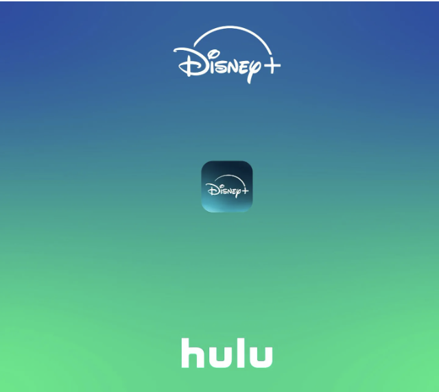
Disney+’s new logo design comes due to the impending merger between the streaming platform and its sister company, Hulu. (UPDATE: This merger officially started on March 27th!) Hulu is typically known for its vibrant green logo, so this merger (and green color) has influenced the new color of the Disney-owned streaming platform, Disney+.
©Disney
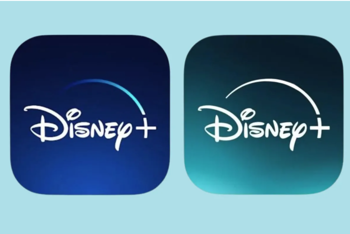
The newest update to the logo is the teal background color, which is a combination of the navy blue Disney+ color and bright green Hulu color.
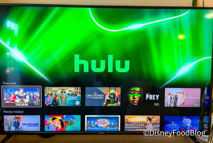
Disney+ Hulu bundle
The updated design is now sported on the Disney+ website and app store platforms for download and could help the streaming service stand out against the competition. Most other popular streaming services like Prime Video, Max, and Paramount Plus all sport a variation of a black or blue background to their apps and splash pages.
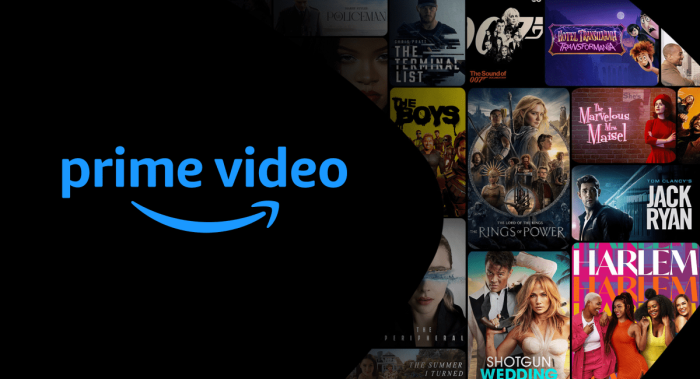
©Amazon
However, the color isn’t the only change on the logo. The sweeping arc above “Disney” was previously a gradient-colored line, but now it is a solid white line arcing above the words.
Disney has shared that “the color is named Aurora, both for the aurora borealis, but also as an homage to Princess Aurora” They said, “It’s beautiful, a bit more adult, and signals a change.”
The new color is meant to mark “a new chapter in storytelling for the streaming service.”
Hulu on Disney+ officially launched on March 27th. Disney said, “Bundle subscribers will now have the full Hulu on Disney+ experience, which includes Hulu content integrated into recommendations, sets, and collections across Disney+, making it easier to discover thousands of general entertainment titles and explore the impressive breadth and depth of Hulu and Disney+ content.”
This change has been Beta tested for a while, but now it’s official.
We’re always keeping up with the latest Disney changes from the theme parks, to the cruise lines, and everything in between. Be sure to check back in with us for all the latest changes as they come!
NEW CHARACTERS Announced for Tiana’s Bayou Adventure in Disney World
Join the DFB Newsletter to get all the breaking news right in your inbox! Click here to Subscribe!
Do you prefer the updated look? Give us your thoughts in the comments below!









 Our handy (and portable!) ebook guides make sure you get the best deals and can plan a vacation of a lifetime.
I am a huge Disney+ fan!!! We have been for many years. I Love the new logo! It really stands out with its’ beautiful new color. My problem is with the movie menu change. From the homepage, after clicking, let’s say Marvel, It no longer brings the clicked upon movie to the upper, easier to see banner. It just shows an enlarged Marvel icon. This was so very disappointing to me. I really depended on that, especially upon waking up in the middle of the night. I would go to Disney+ over others, so often, because of that helpful feature. I hope you bring that feature back.